I taught English in a handful of state Middle schools in rural Japan between 1998 and 2001. I also had a great interest in the traditional arts of Japan, having studied Japanese art history at university. I was particularly drawn to calligraphy, known as shodo. It’s so much more than just writing, it’s an expressive art form with its own complicated history and rules. Legibility is not necessarily the key factor. Nor (unlike much Western calligraphy) is neatness the sole purpose. This living art form (which continues to have avant-garde practitioners pushing the boundaries) always struck me as a sort of proto-abstraction, using language as a peg from which to hang a fascination with the tactile pleasure of brush and ink, in an almost a choreographed dance of physical mark-making. Whilst living over there I was lucky enough myself to study shodo, which is ranked like martial arts in levels. By the time I returned to England, I’d progressed through all ten kyu or student levels, and ended up rated as a practitioner at the second dan. That in mind, here’s a whistle-stop beginners tour through Japanese calligraphy…
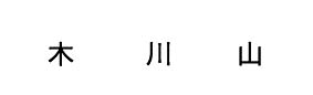
It helps, I think, to start off with the bare basics of the history of the language. Japan had a very advanced culture by the Kofun period (250-538 AD), but they didn’t have a unified indigenous system of writing. At the end of Kofun, however, diplomatic relations commenced with China – and Japanese scholars learnt Chinese. Chinese characters have as their origins simplified pictures of objects in the world. These ideograms were adopted pretty much wholesale by the Japanese and mapped onto the linguistic concepts of the pre-existing native Japanese language. The characters borrowed from Chinese are known as kanji. Some kanji look vaguely akin to the words they represent; for example ki is very obviously a schematic of a tree, kawa a river, and yama a mountain.
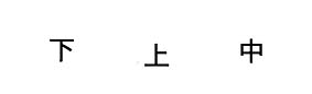
Some slightly more abstract concepts are still fairly easy to guess; shita and ue are below and above, while naka is middle.
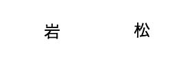
More complex characters often contain, as constituent building blocks of meaning, other simpler kanji, known as ‘radicals’. For example you can see that the character iwa – rock – includes the radical for mountain at the top. Similarly the character matsu for pine tree contains, on the left hand side, the radical for tree.
These radicals sometimes help us to guess at the meaning, and occasionally they can even be humorously telling. The character for drunk is made of three radicals; a bottle, and the digits 9 and 10; drink 10 bottles and you will indeed be drunk. ‘Safe’ is represented by the radical for female, under the radical for roof. But that same combination of radicals also has another meaning; cheap.
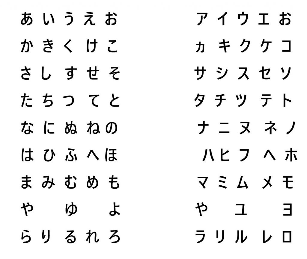
If this doesn’t quite seem complex enough, Japanese also has two syllabic alphabets, completely distinct from kanji. The spoken languages of Chinese and Japanese are very different. Japanese has tenses and verb conjugations which simply don’t exist in Chinese – and so the early scholars who attempted to map the writing system of China onto Japanese were left with a problem. How could a pictographic language deal with verb endings?
Buddhist monks of the Nara period (710-794) began the process of inventing an alphabet that could be used alongside kanji to ensure that all spoken Japanese could be expressed in writing. Two distinct alphabets called hiragana and katakana emerged. Hiragana was for writing Japanese, whilst katakana existed to phonetically transcribe foreign sounds (eg. English loan words like terebi, television, or rajio, radio.)
Japanese calligraphy is itself sub-divided into five main styles, comparable loosely with the differing ‘hands’ of Western calligraphy. At the most formal end of the spectrum is tensho, or seal script – a stylized and archaic ornamental version of kanji that most modern Japanese would find it difficult to read.
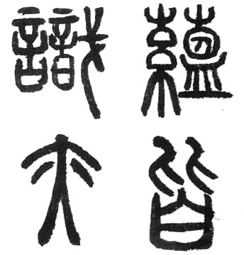
Next comes reisho or clerical script – more legible but still stylized.
Kaisho, or regular script, is considered the most legible, everyday hand. It’s the basis of ordinary handwriting, features as the default style in many kanji dictionaries, and is the first calligraphic hand practiced by beginners.
After kaisho come the ‘joined up’ styles of writing. Gyosho is semi-cursive but still pretty legible.
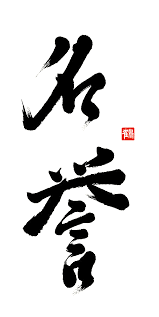
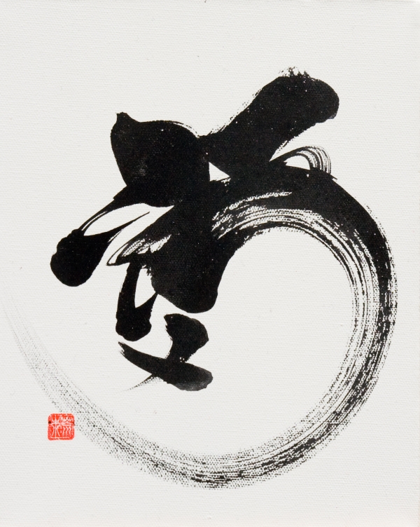
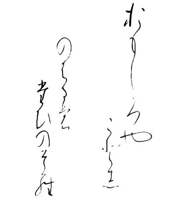
Sosho is the most abbreviated and difficult to read style, written in a quick and flowing line.
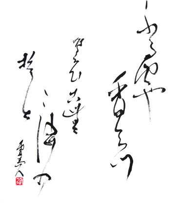
It could be said that sosho is the closest to a uniquely Japanese calligraphic style, because the flowing line fits extremely well aesthetically with the simplified syllabic hiragana alphabet. Personally, I have little fondness for the more stilted, formally regimented tensho and reisho – but the spare beauty and subtle undulations of gyosho and sosho possess a certain magic.
*
As a student of calligraphy, my weekly two hour class consisted of some broad brush calligraphy (usually kaisho or gyosho), followed by an hour of sosho with a very small thin brush. For kaisho the jet black ink came pre-mixed in a bottle. The paper was incredibly thin and absorbent and, when the brush was loaded with ink, decisiveness was the very essence of the whole enterprise. Hesitation was impossible. Strokes needed to be made with complete confidence. Some strokes required the brush to flick away and make a pointed tail as the brush lifted off the page at a perfect angle.
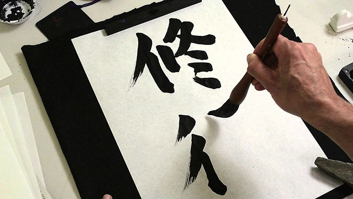
As with all traditional Japanese arts, the emphasis was not on my own personal expression or innovation. I copied examples provided by the teacher over and over, to perfection. All Japanese characters have a stroke order, and I was not permitted to deviate from this. Afterwards the teacher would correct my many errors in red calligraphy ink.
For sosho practice, only a few drops of ink were required. I poured a dash of water into an ink stone, then proceeded to grind a block of solid ink against the grainy wet surface of the stone. This more fluid ink was better suited to the thin undulating lines of the joined-up calligraphy.
Sosho looks so spontaneous and immediate – but to a beginner it was a millimetrically regimented art form. For the most part (save for a few very special occasions) I was only permitted to copy verbatim the fluid lines of my teacher. Every aspect was rehearsed, then repeated and repeated. The moments where the line became thicker correspond to the act of replenishing ink on the brush – but even these moments were strictly dictated by the teacher. Nothing was left to chance.
My teacher Mrs Sumida was an elderly widow, a completely traditional Japanese lady. When I arrived at her house she would always fall to her knees and touch her head on the floor in a deep bow which I found flattering if faintly embarrassing. She used the most archaically distant (but respectful) verb forms to speak to me. Her politeness precluded her from ever explicitly describing my work as ‘bad’, although I soon learnt to decipher the secret language of her critique. All my work was, in her estimation, sugoi – impressive. At first I found this disheartening; everything I did self-evidently wasn’t good, so why couldn’t she just say so? Eventually I noticed an inflection in her pronunciation. Sugoi uttered sharply and with a casual bluntness meant ‘this is basically crap.’ Sugoi uttered with rising intonation and eye contact meant she really did think it was good. (This happened to me a lot in Japan. Reading between the lines was a survival skill)
The table at which I practiced my calligraphy was very low, and I sat on the tatami mat floor to do my writing. Mrs Sumida insisted I sit seiza style – not cross-legged but kneeling back, sitting on my calves. Pins and needles and agonisingly painful legs all seemed part of the process.
My efforts were posted off to Okayama City each month for the shady prefectural calligraphic powers-that-be (who I never met) to decide if my brush skills entitled me to move up another level. Luckily they never demoted me, so my progress was slow but sure.
Looking back, calligraphy was – corny though it may sound – a good way to focus the mind (in rather a Zen fashion) on the minutest increments of the here and now, from the tiny elements of pressure required to make a mark thick enough, to the speed and clarity of purpose required to get a strong and confident line. Now I’m a painter, I look back on this as a masterclass in brush control. It also taught me that looks can be deceptive. Sometimes that which seems spontaneous and effortless is precisely that which requires the greatest devotion and study.
(Edit: Accompanying images here are representative examples, not examples of my own shodo work – very few of which I still possess)
2 thoughts on “Japanese Calligraphy”
Really interesting -thank you Peter! I’ve often wondered how Japanese calligraphy works- such a fascinating balance of expression and control. Now I know!
Thanks Guy – so glad you enjoyed it!