During a trip to the Walker Art Gallery in Liverpool, I am quite surprised to find a painting by Stuart Sutcliffe. I’ve read a book about this man. I’ve seen a movie about him. I’ve even leafed through a graphic novel about his life. Until this moment I’ve never actually seen his artwork.
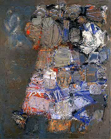
Sutcliffe was, of course, the ill-starred original bass player with The Beatles. John Lennon loved him, to the extent that Paul McCartney often felt jealous. He was a passionately driven visual artist, who quit the band to follow his painting career before dying of an aneurysm at 21, just months before his former band mates hit the big time.
I like this picture. It’s very much of its time, broadly abstract expressionist in style and heavily worked in sludgy earthy tones which scream late ‘50s. Yet it’s difficult, of course, to really evaluate this picture from under the layers of legend. Am I feeling the artwork or the aura of history? It’s like a cross between a painting and a holy relic. Would I have even stopped to look at it if it wasn’t by a Beatle circa 1961? I like to think so, but I guess I will never be able to say.
In the neighbouring room, there is a retrospective of canvasses from over fifty years of the John Moores Painting Prize. The early fate of this prize seems linked in some way with Sutcliffe and the Beatles, too. Moore, the founder of Littlewoods, set it up in 1957 – a culturally auspicious year for Liverpool. Just down the road, on Mathew street, the Cavern club opened its doors for the first time.
In 1961, Sutcliffe entered one of his paintings to the junior category of the prize. He was a runner-up and John Moore purchased his piece for £65. This money, a not inconsiderable sum fifty years ago, went directly towards equipment for the fledgling Beatles. Sutcliffe lost out to Peter Blake, whose ‘Self Portrait with Badges’ won the junior category. Years later, when Blake began work on the Beatles’ Sergeant Pepper sleeve (which, incidentally, features Sutcliffe in its collage of cover stars) John Lennon was at great pains to point out to Blake that his beloved Stu should have won.
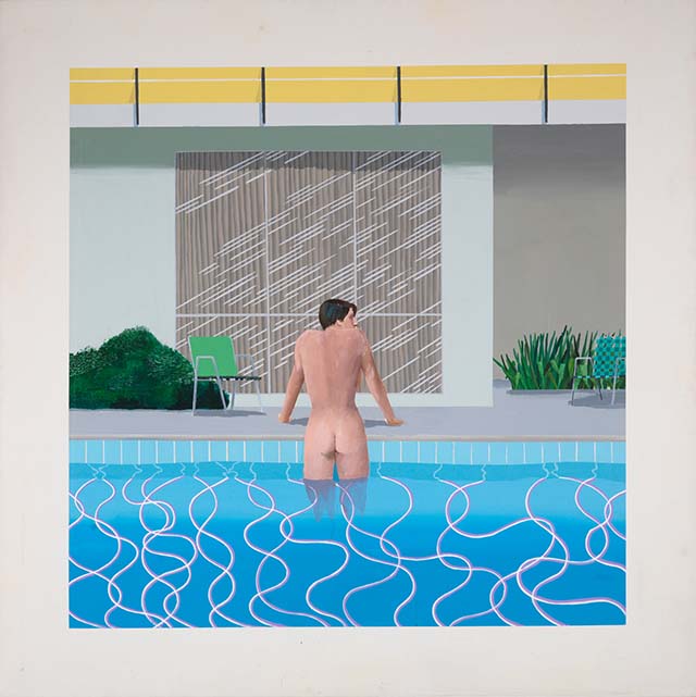
In this room of past John Moores prize winners, I find I now have the opposite problem from the Sutcliffe painting – no backstory. I know nothing, or next to nothing, about the painters. The Peter Blake isn’t there (the Tate now own it), which means the only legitimately famous past winner here is David Hockney, who won in 1967 for ‘Peter getting out of Nick’s pool.’
There is no identifiable house style in this room (thank goodness). The only obvious unifying factor across sixty years is scale. Every winning picture, save for Keith Coventry’s 2010 piece, is painted on a large canvas which completely fills the viewer’s field of vision. They all impress to wildly varying degrees, and offer a kind of potted history of artistic fashions. Jack Smith’s ‘Creation and Crucifixion’ won the inaugural award in 1957. It’s a product of the 50s ‘Kitchen Sink’ school – brown, austere and uncertain of its own postwar future.

Just a few years on, the mood lightens a little and abstract expressionism takes the stage. Less uncertainty and angst here. Roger Hilton’s winning piece, ‘March 1963’ does have a certain attention grabbing presence to it. The wall label tells me that Peter Lanyon, one of the selection judges, ‘told John Moores that it was the best painting to come out of Britain since the war.’ I would dearly love to have heard Lanyon’s explanation of the significance of this work, as it leaves me somewhat mystified. What did Moores make of it?
Hilton was presented with his generous financial prize at the grand awards ceremony in 1963. The story of his behaviour that night is both gruesome and hilarious, and somewhat overshadows the painting. At the press call, the sozzled Hilton apparently pretended to kick the canvas. ‘They are terrible pictures’, he announced of the exhibition selection. John Moores himself was next up for a tongue lashing. ‘Give me the cheque’ he bellowed, ‘You look like a decaying oyster!’ He wasn’t finished yet. Local MP Bessie Braddock was there with her husband, whose haircut Hilton proceeded to mock. John Braddock reacted to this public shaming by promptly collapsing and dying of a heart attack. ‘Artist’s behaviour kills Alderman’ went the headlines the next day.
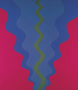
Jump forward just a few years. Now fashions have shifted into an even more optimistic, yet neater and unmistakeably sixties mode with Michael Tyzack’s prizewinner ‘Alesso B’. The Swinging part of the decade has arrived. You’d only need to add the words ‘Soft Machine’ or ‘Jimi Hendrix Experience’ to turn this into a psychedelic album cover, though admittedly it was ahead of this particular fashion curve, winning the prize in 1965 before psychedelia really exploded. The wall label explains that Clement Greenberg, influential American critic and exponent of exactly this kind of flat abstract Colour Field painting, chaired the judging panel that year – indicative of the extent to which these prizewinners (as with any other award for creative endeavour) merely reflect the personal tastes of the critical cognoscenti.
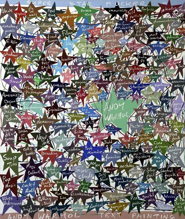
In the ensuing decades, John Moores winners have tended to reflect the fractured trends of Postmodernism rather than signposting major art movements (Minimalism, Pop etc) or falling quite so easily into fashion categories. A figurative or an abstract piece can win these days, but the overall emphasis in either case has shifted towards the conceptual. The ‘Sensation’ generation of YBAs are represented in this room by Peter Davies’ ‘Super Star Fucker’, a large and garish text painting of a gigantic mind map that relates everything back to Andy Warhol. This isn’t a diagram from which Davies intends you to learn anything. Essentially meaningless topics from culture are splurged. High art (‘Leonardo’) leads to low (‘Jacko’), while complex theory (‘Post Minimalism’) brings one eventually to mass culture (‘Studio 54’). Since Warhol, Davies seems to say, everything’s on the menu, and nothing is off limits. This picture, as with those 1960s offerings, is quintessentially of its time, holding a mirror to the trashy, stardom obsessed Now Magazine world we inhabit.
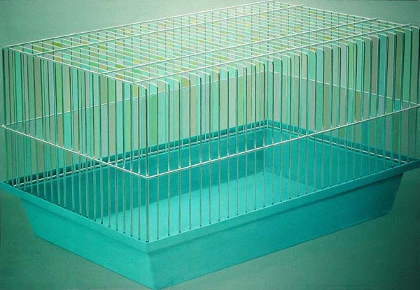
Dan Hays’ 1997 winning piece ‘Harmony in Green’ is a more ambiguous painting. Apparently it’s one of the most popular pieces in the entire Walker Gallery collection, and I can see why, for I was immediately drawn to it. The painting, executed in a neat and meticulous style, depicts a hamster’s cage, rendered at a scale big enough for a human occupant. The colour scheme comes from Monet’s famous waterlily painting of the same name. The Monet piece may reflect the boundless energy and freedom of nature, but Hays shows us a rigid, featureless, pre-manufactured space designed to keep an animal captive for its entire life. The cage fills the canvas, whose borders impose their own limits to make, as Hays writes on his website, ‘a cage within a cage.’ Is the cage a terrible place or is it a place of safety? It doesn’t look so awful, and the wall label tells us the artist himself has described it as a ‘desirable space to occupy.’ Personally, I can kind of relate to this. Cages have been a persistently recurring symbol in my dreams for years. In my dream narratives they represent, not captivity exactly, but more a kind of insipid, compromised, lifelong form of sanctuary. Maybe this is what Hays means by ‘desirable’. Desirable doesn’t always mean good.
The John Moores room contains an almanac of postwar styles, yet intriguingly it only represents the tip of the iceberg. For each of the prizewinners, there have been a host of runners up, and a great many of these pieces now reside, mothballed, in the permanent collection of the Walker. When the full riches of this archive are explored and displayed… now that will be an exhibition worth seeing.